 by Kimberly Blackford
As a new year dawns, color trends emerge. It may hard to believe but many of the sweaters we wear this year, napkins and tablecloths we buy, and throw pillows we place on couches will surprisingly resemble each other in color. Thanks to the “color of the year”, one color or a few chosen palettes will stand out from the crowd and become the colors that will fill our closets, homes and lives without most of us even noticing. Call it a marketing ploy, but colors really do become a part of the times. So, when you look back 10 years from now, this color will make sense.
Last year the color of the year was turquoise, a color that symbolizes healing and compassion. It is also a color inspired by water and sky and represents an escape to many people.
So what could possibly be next?
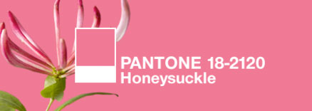
Well, Pantone has released the 2011 color of the year and it is called “Honeysuckle” (Pantone 18-2120). This color oozes confidence, courage and bravery. The bold spirit of Honeysuckle will infuse you, lift you up and carry you though the new year. Full of vim and vigor, Honeysuckle may be a bold contrast to the escapism of turquoise. Honeysuckle forces us to deal with everyday troubles and face them full on. It contradicts the bleak economy and overabundance of bland colors in the marketplace currently. During stressful times, a color such as Honeysuckle will lift people’s spirits and stimulate, says Leatrice Eiseman, executive director of the Pantone Color Institute. Caught between an intense pink and a red, Honeysuckle is a color that can easily be worn by both men and women. It’s a striking and eye-catching hue that looks good both day and night and will add a lively flair to interior spaces when used on walls, pillows, bedspreads, small appliances and tabletop accessories.
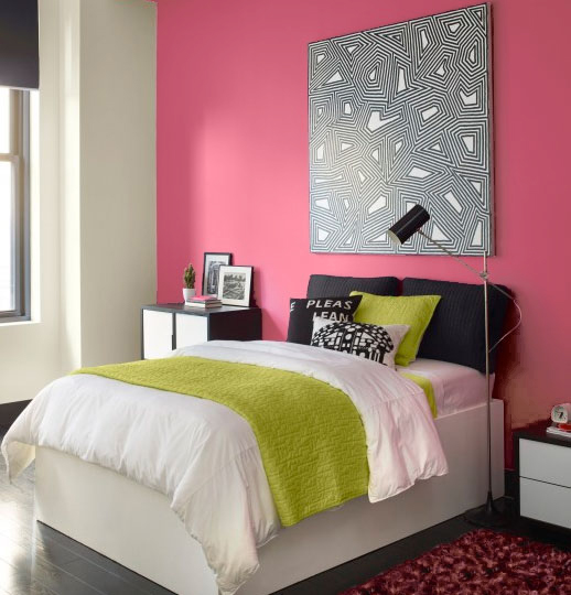
Honeysuckle is an updated color that will add a bold and dynamic feel when used in large areas of a house like an entry, bedroom or living room. If used in the kitchen or dining room, it will be an appetite stimulant. But, to incorporate this color into the kitchen use it with placemats, linens, glassware, candles and appliances. If you need to cover old or shabby cabinetry, try Honeysuckle. Or, for an even bolder statement, paint an accent wall in Honeysuckle for a lively burst of energy in the kitchen, hallway, or family room.
Because Honeysuckle is a more feminine color, it may not be a decorator’s first choice when trying to stage a home for selling, but if done with subtle touches, no doubt the home for sale will stand out in the crowd.
Other Color Palettes That Will Shine
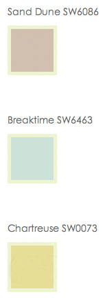
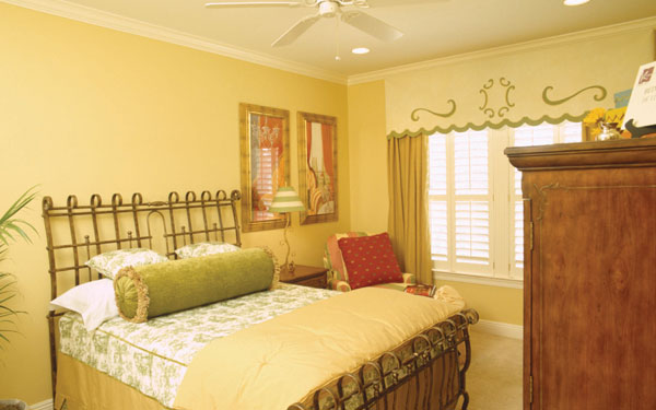
For a cheerful and light-hearted home, try a citrus yellow shade. Not only does it exude positive energy, it will keep your mood pleasant for quite awhile. Use this color in unexpected areas such as a powder room or dining room. It also looks fantastic mixed with a soft blue and khaki color. Research has proven that the color yellow is uplifting, helps people fight fatigue, limits anxiety, enhances relaxation and allows people to maintain a positive mood. Who wouldn’t want that color surrounding them?
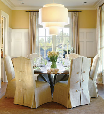
View This House Plan above, or view other Luxury House Plans.
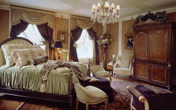
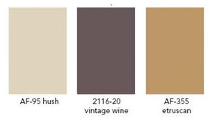
With vintage looks making a comeback, smoky violets, deep browns or burgundy, berry colors and even bronze will transform your home’s interior spaces into something rich and elegant. Classy and sophisticated, pair these colors with dark wood furniture and leather upholstery and your home will exude style.
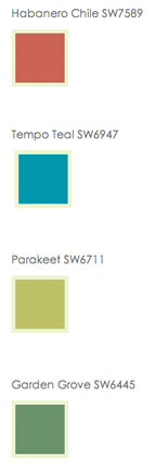
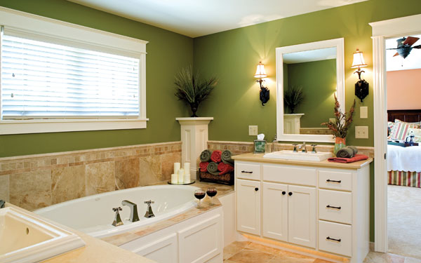
Quite the opposite in many ways to the vintage palette is the color palette inspired by the farm. With society’s current feeling of getting “back-to-basics,” this color palette uses the colors often seen at a local farmer’s market for inspiration. Playful oranges, leafy greens, bold blues and textured brown tones will give your home an earthy back-to-nature feel.
View This House Plan
View Other Plantation House Plans
View This House Plan
View Other Craftsman House Plans
Another example of a luxury bathroom using the farm color palette above.
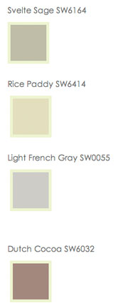
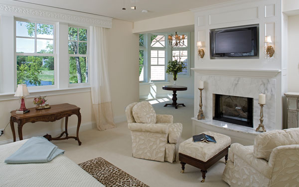
Last year, turquoise was a the color of the year and symbolized an escape, so if you’re wanting to hold on to that fantasy, but switch gears just a bit, why not try translucent colors with a pearly or satin finish? Creamy whites, soft grays and neutral sage colors will continue making your home feel like an escape while adding a soft retro feeling.
View This House Plan
View Other Luxury House Plans

Getting back-to-basics in the way we live will also resonate with another color palette that includes tribal colors and many other earthen tones. Tribes mirror the concept of today’s communities and reflect how we want to live in the upcoming year. Rich oranges, browns, indigo blues and curry colors will dominate in this palette and add excitement to any interior space in your home.
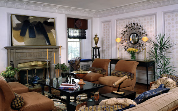
Below is another example using a Tribal color scheme.
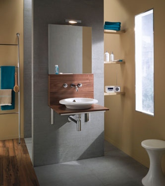
As you can see, 2011 is going to be quite a diverse year! From explosive pink shades to soft silvery gray tones, there’s something for everyone in with this year's color palette trends.
Photo to the left is courtesy of Kohler.
Here are some related articles:
Save this article to:
back to top